
You know the house. If you’ve browsed any Hamptons real estate listings over the last year, you’ve probably seen the house. White shiplap. Weathered grey shingles. Navy throw pillows. A sisal rug.
Beautiful? Yes, absolutely. Surprising? Not even a little.
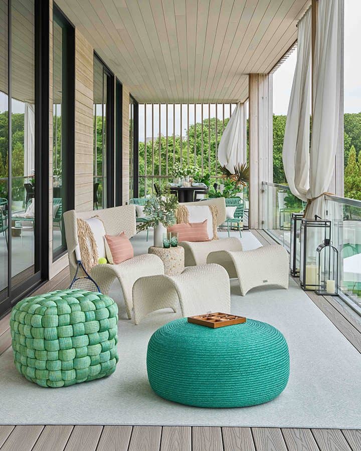
Photo: Marco Ricca
It may once have been true that Palm Beach was Palm Beach, and Water Mill was Water Mill, and never the twain did meet. A new wave of designers and clients is rewriting that rulebook, however, and they’re bringing saturated color, playful pattern, and a Florida-inflected joy to the East End.
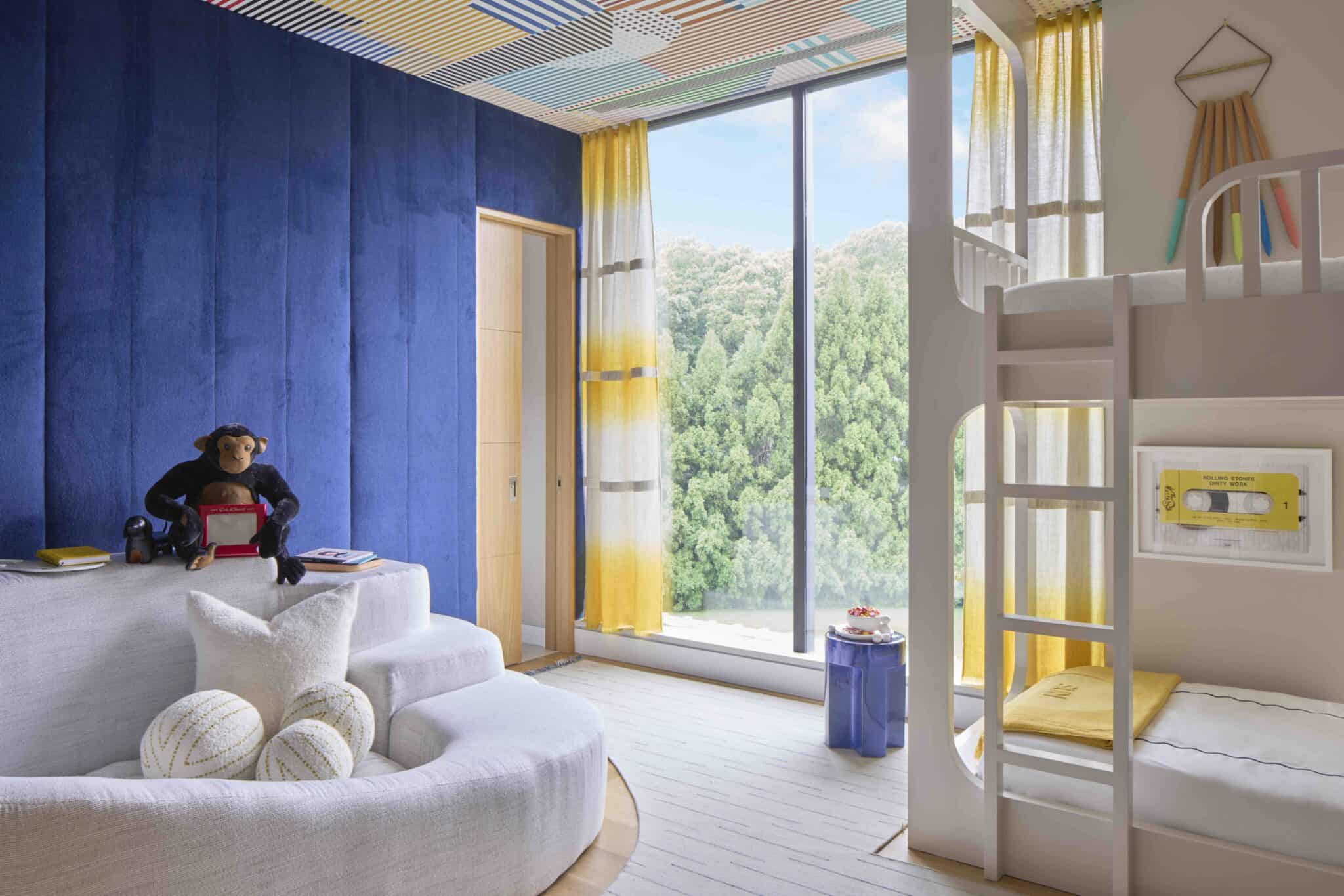
DBD Lifestyles has worked extensively in Florida, perfecting their trademark “whimsical luxury” philosophy. The 2025 Hamptons Holiday House echoed this evolution in color theory. After years of minimalist restraint, it was a lively celebration of wallpaper, color and pattern.
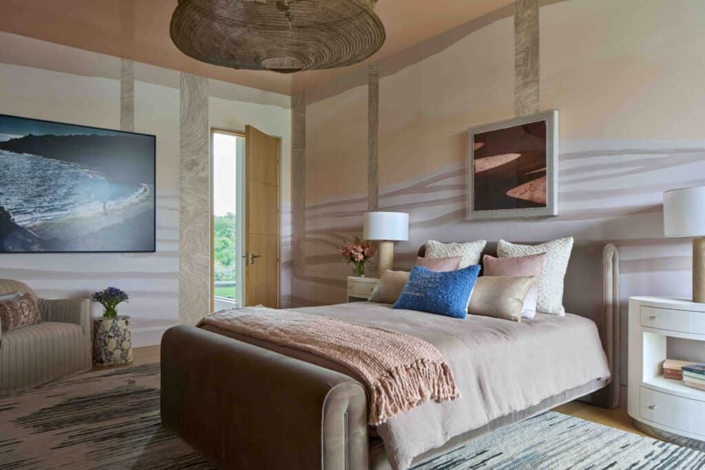
Photo: Marco Ricca
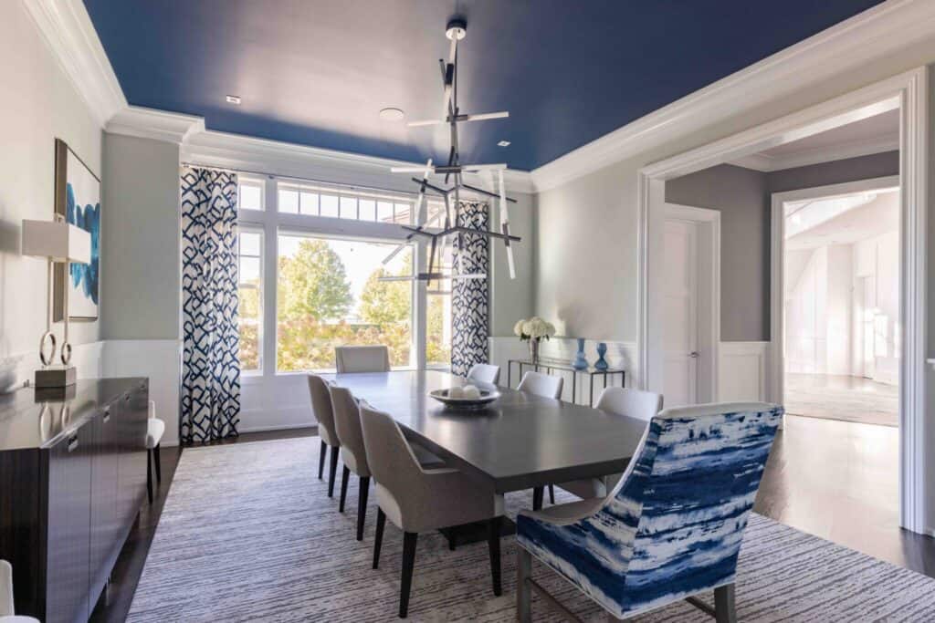
Color in Contrast
The classic look of a Hamptons home, with its restrained neutral palette of whites, creams, grays, and deep blues with weathered wood, has deep roots in the East End. Yet some buyers, owners, and designers feel that palette has become somewhat stale in recent years—maybe even a bit calcified.
Cast an eye down the coast to Florida, and the color tradition is just as strong, and completely different. With bold colors, including shots of citrusy orange, lemon yellow, and bright lime green, Palm Beach and environs know how to embrace a sensibility that’s whimsical and full of surprise. That sensibility never quite made it up I-95—until now.
What’s more, it’s a move that’s taking root throughout the design industry. Many roundups of decor experts predict a move toward deeper infusions of color in multiple ways. DBD Lifestyle’s Zoe Grant puts it plainly: “Hamptons style can be so much more than blue and white and definitely way more exciting than gray.”
How to Craft the New Palette
If the colorful mood is striking you, keep a few general principles in mind while you’re deciding what colors to put where:
Lead with DBD’s foundational framework: pick one or two base colors and commit. Their working palette is typically one bold standout, one neutral, and two coordinating accents. The key is that these colors rotate roles room to room. One room’s accent becomes the next room’s hero color. This creates cohesion without monotony.
Grant says that the specific shades the DBD Lifestyles designers are loving right now are citrus tones, especially citron which has “so much life to it.” This is part of a broader moment. See, e.g., Livingetc’s 2026 trend forecast which flagged a “punchy citrus hue, underpinned by a tart yellow base” as the defining accent emerging in high-design interiors.
Consider taking different approaches to public and private spaces in your home. For instance, Grant says that DBD Lifestyles designs tend to go bolder in living rooms, kitchens, and entryways, and more serene in bedrooms. Or experiment with deep terracotta hues and other dramatic shades in powder rooms and offices while keeping main living areas lighter; it’s a “toe in the water” approach that works as a gateway if you’re a little nervous about going overboard.
Photo: Marco Ricca
The Entry Points: Five Ways to Start
Ready to inject some Florida color into your currently neutral-hued home? Follow these four tips from DBD Lifestyles.
- Start with a single object you love. Madeleine Blanche of DBD Lifestyles suggests finding one key piece—a funky vintage lamp, a hand-painted ceramic, an unusual plate—and pulling the room’s palette from it, and says, “You’ll quickly find that everything else will naturally flow.” This is a low-commitment way to arrive at a color scheme that feels personal rather than prescribed.
- Invest in an artisan rug. Handmade rugs in bold patterns and colors are DBD Lifestyles’ go-to for a quick infusion of personality. They add warmth and visual complexity without requiring paint or wallpaper and are relatively easy to swap out as tastes evolve. Look for pieces with geometric or floral patterns in your chosen accent colors.
- Use wallpaper strategically or cleverly. Bold wallpaper is a DBD Lifestyle signature, but for the color-hesitant there’s a lower-stakes entry: use a colorful, patterned wallpaper as matting for photos or framed art. It introduces color and pattern in a contained, reversible way.
- Go bold on the ceiling color. Dining rooms, powder rooms and mudrooms are ideal laboratories. Small rooms carry color well and give you a contained experiment before committing more broadly.
- A (Non-)Cautionary Note
If you’re still worried about embracing a more saturated color palette, let Grant reassure you. Her official position: “Be less cautious. It really isn’t that serious. Everything in the home can be undone.” The reward for experimenting is a home that looks like no one else’s.
The one real principle to embrace is cohesion. Aim for a flow of color and pattern throughout the home instead of isolated pockets. A bold living room that has no dialogue with the adjoining hallway can feel jarring. Use DBD Lifestyles’ guiding rule: every room should contain at least one thing that makes you look twice—an unexpected color, a bold wallpaper, a singular piece of art. Blanche says, “It pulls you in and keeps rooms from looking like a catalog.”
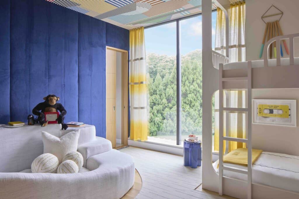
Photo: Marco Ricca
A Few Final Colorful Thoughts
The Hamptons has always had its own design identity. It’s not about to become Palm Beach in a single season. But the door to color is open, and the new generation of buyers and designers walking through it shows no signs of turning back.
Perhaps the most Hamptons thing of all is having both and knowing exactly which one is yours.