
The 2022 Color of the Year is an Empowering Mix of Newness.
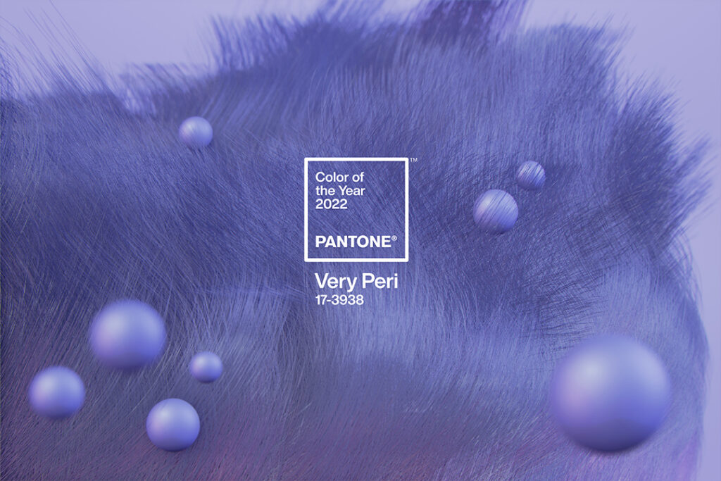
When you hear “Very Peri”, what do you see in your mind’s eye? A fistful of warm-hued blue crayons? A bouquet of fresh, purpley-blue flowers? Do you immediately think happy, stress-free thoughts of a kinder, gentler time? If so, that’s exactly what the Pantone Color Institute, the provider of professional color language standards and digital solutions for the design community, was shooting for when they introduced PANTONE 17-3938 Veri Peri as the 2022 Color of the Year.
Living in a world driven by Covid considerations has created a highly-stressed environment for many. Very Peri – described as a “dynamic periwinkle blue hue with a vivifying violet red undertone” – serves as Pantone’s response to these day-to-day stressors and the general zeitgeist of the world. According to the company, Very Peri blends “the faithfulness and constancy of blue with the energy and excitement of red” to create the happiest and warmest of all the blue hues. Very Peri is an “empowering mix of newness.”

For the past 23 years, the experts at Pantone have searched worldwide for new color influences, ranging from art, design, fashion, entertainment and travel destinations to new technologies, materials, textures, social media platforms and sporting events. With Very Peri, Pantone strives to “place the future ahead in a new light.” For the first time in the Pantone Color of the Year history, the experts went back to the lab to create a brand-new color for the Pantone palette. “The Pantone Color of the Year reflects what is taking place in our global culture, expressing what people are looking for that color can hope to answer,” states Laurie Pressman, Vice President of the Pantone Color Institute. “Creating a new color for the first time in the history of our Pantone Color of the Year educational color program reflects the global innovation and transformation taking place. As society continues to recognize color as a critical form of communication and as a way to express and affect ideas and emotions and engage and connect, the complexity of this new red-violet-infused blue hue highlights the expansive possibilities that lie before us….It is a color that really places the future ahead in a new light,” continues Pressman. “We feel this was the perfect color to get those feelings about the future across.”
Renewed hope for the future underpins Pantone’s ideology about the effect of Very Peri upon the world around us. As 2022 rolls out and the pandemic continues to shape our lives on every level, Leatrice Eiseman, the executive director of the Pantone Color Institute, believes Very Peri embraces this uncertainty with a sense of cautious optimism. She also shares that Very Peri reflects the strong influence of the metaverse and gaming platforms. “There is just no question that gaming influenced the continued usage of Very Peri,” states Eiseman, “and we really want the Color of the Year to be reflective of what is happening in the world around us.” Very Peri reminds us that preconceived notions and standards are changing, as our physical and digital lives have merged in new ways. “Displaying a carefree confidence and a daring curiosity that animates our creative spirit, inquisitive and intriguing PANTONE 17-3938 Very Peri helps us to embrace this altered landscape of possibilities, opening us up to a new vision as we rewrite our lives,” sets forth the company on its website. “Rekindling gratitude for some of the qualities that blue represents complemented by a new perspective that resonates today, PANTONE 17-3938 Very Peri places the future ahead in a new light.” The fusion of the constancy and continuity of blue with the energy and excitement of red creates a new color conveying a message of credibility as well as creativity. “Whether appearing in a fantasy digital realm or in physical materials, PANTONE 17-3938 Very Peri exudes a good-natured warmth that quickly engages the eye, making it an ideal shade for many applications of graphic and multimedia design as well as packaging.”

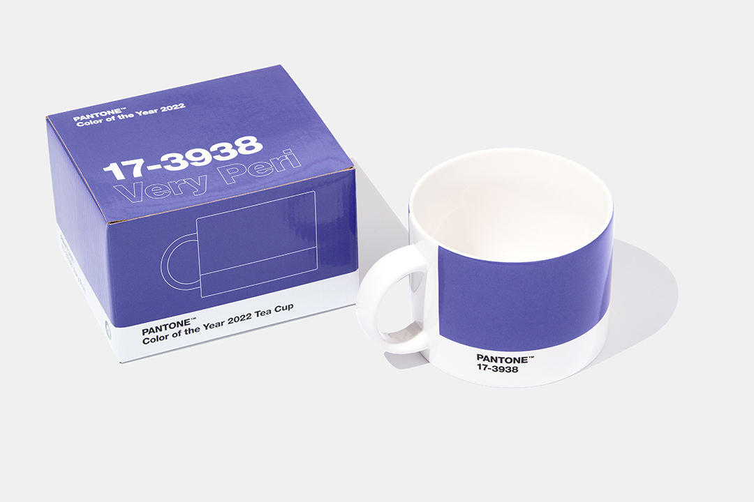
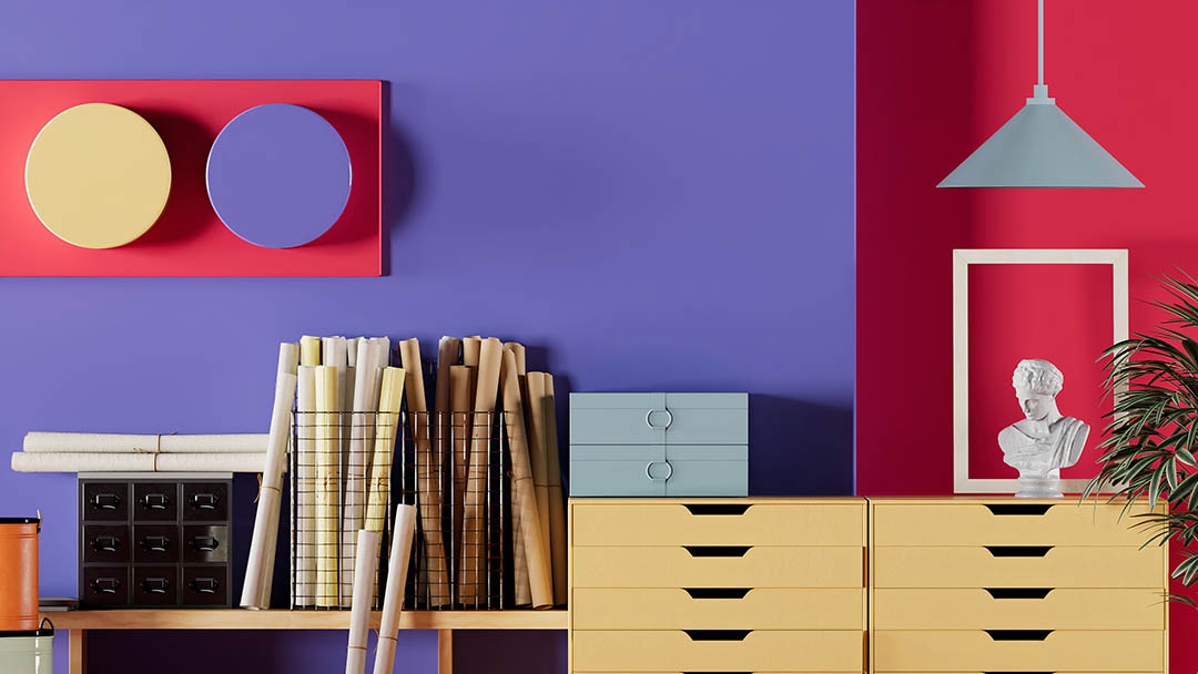
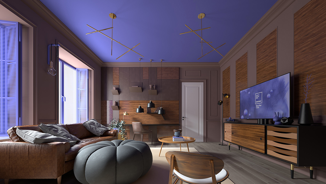
And Veri Peri’s influence is not limited to computer games, wall paint and art supplies – it’s trending all over spring fashion and cosmetics. Gucci, Valentino and Louis Vuitton prominently featured Very Peri in the spring fashion shows; it is also the hot color for yoga pants, knit sweaters, lingerie and socks – not to mention nail polish and eye shadow. Even art galleries have gotten in on the action! ARTECHOUSE, the digital design gallery located in New York City’s West Village, recently featured Very Peri in an immersive, custom-designed exhibit specially created to evoke the emotion and feel of the color. The exhibit will open to the public later this winter. While you’re there, don’t forget to order the Very Peri custom cocktail from ARTECHOUSE’s newly opened XR Bar. Reserve your tickets at www.artechouse.com.
It’s been a long two years and maybe Veri Peri is just what we need as we continue to face uncertainty in this new year: an empowering mix of newness that’s just a really pretty color. I’ll take it.