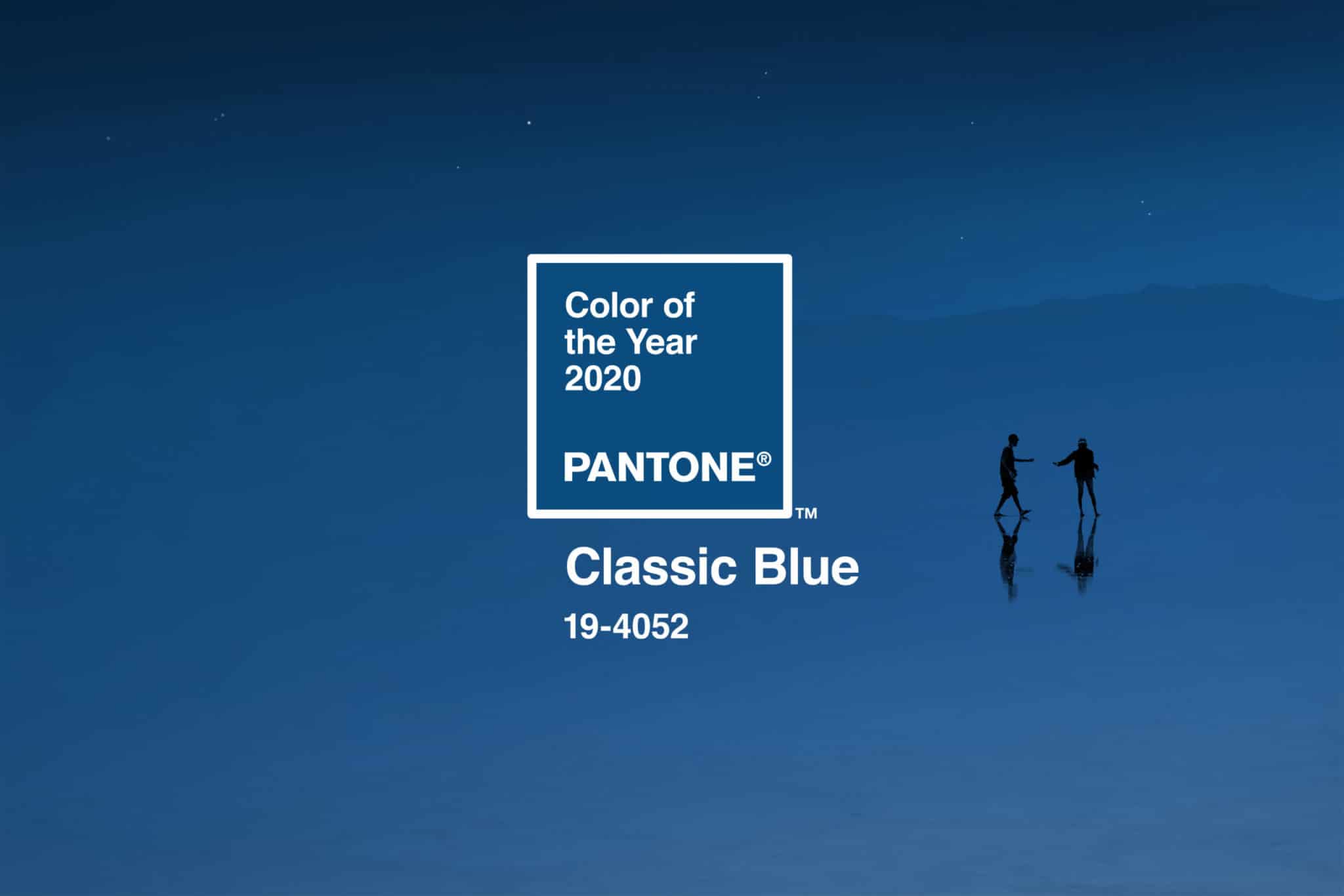
Classic Blue is an East End favorite
Anticipation for a new decade made the ringing in of 2020 more exciting than New Years’ past. A fresh wave of new beginnings and change washed over as the clock ticked past midnight, lists of resolutions and intentions ready to be ticked off. For designers, it is a time to reset and reimagine living spaces with the veritable leader of color – Pantone. Announced in December 2019, the provider of professional color language standards and digital solutions revealed PANTONE 19-4052, Classic Blue, as the Pantone® Color of the Year for 2020. With excitement and eagerness, interior designers on the North Fork and in the Hamptons share how this shade embodying the East End is made to last.
Classic Blue instills a sense of calm, confidence, and connection. It taps into sight, sound, taste, and texture, and is Pantone’s first multi-sensory Color of the Year in the company’s history. This thought-provoking hue, suggestive of the sky at dusk, highlights a desire for a dependable and stable foundation to build upon in a new era. According to Pantone Color Institute executive director Leatrice Eiseman, its need could not be more relevant.
“We are living in a time that requires trust and faith,” said Eiseman in a press release. “It is this kind of constancy and confidence that is expressed by PANTONE 19-4052 Classic Blue, a solid and dependable blue hue we can always rely on. Imbued with a deep resonance, PANTONE 19-4052 Classic Blue provides an anchoring foundation. A boundless blue evocative of the vast and infinite evening sky, PANTONE 19-4052 Classic Blue encourages us to look beyond the obvious to expand our thinking; challenging us to think more deeply, increase our perspective and open the flow of communication.”
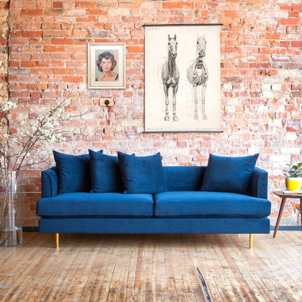
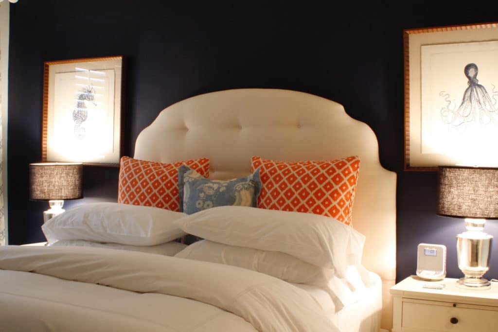
For designers on the East End, Classic Blue is a strong color that has long defined the area. Surrounded by water that is embedded in the East End’s very way of life, there is a thrill in the challenge of incorporating various hues into designed spaces without crossing into beach kitsch. Knowing the indigo hue is a familiar sight on the East End, designer and owner of touchGOODS in Southold, Norine Pennacchia, shares the shade comes from the sky at dusk, serene waters, and even a bowl of perfectly ripe blueberries found in the abundant farm stands. It serves as a timeless and enduring hue.
Many of Pennacchia’s clients naturally gravitate toward the coastal beachy blue vibes. “The soothing shade with its pop of deep color also pairs perfectly with a lot of the mid-century design furnishings that we carry at touchGOODS as well,” she explains. “With mid-century modern style rooms, the one thing you won’t find is tons of excess. Instead of ornate embellishments, the mid-century look is all about stripping items down to their barest elements, clean lines and letting their function become the star. We believe that Pantone’s Classic Blue can be the star of any room.”
The Pantone Color Institute has found that technology continues to race ahead of human ability to process it all. With this in mind, people naturally gravitate toward colors that are honest and offer a promise of protection. Vice president of the institute, Laurie Pressman, shared that society continues to recognize color as a critical form of communication, and designers and brands should feel inspired to use color to engage and connect.
The human connection people seek in Classic Blue is something that resonates with designer James McAdam, whose eponymous firm has completed multiple projects in the Hamptons, New York, Aspen, Palm Beach, and Los Angeles. “When I think of blue I think of days when I’d go camping and look up at the clear blue sky,” he says, adding the color is finally getting the recognition it deserves. “My favorite pair of blue jeans. The ocean and all the great beaches I have been fortunate enough to see. Blue is dependable and reliable. It’s a solid foundation that just makes you breathe a sigh of relief.”
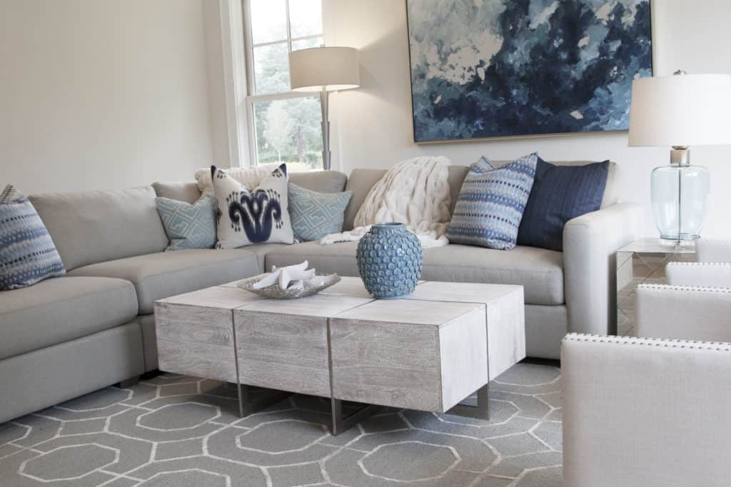
Another beauty of Classic Blue is its ability to complement multiple color palettes. For a modern beach look, the shade works well with neutral colors like cream, gray, beige, and white. It makes for a natural fit with other coastal tones like shades of green, sand, and stone. In an ombré style, the color blue ebbs and flows into various shades, creating a sense of movement like the water many are so drawn to. McAdam agrees it is easy to build upon a blue palette, suggesting a bolder complementary color like orange, which opens up a whole new set of options. It is a restful color, bringing peace and tranquility. With the North Fork and Hamptons real estate markets appealing to those looking for a place to escape, Classic Blue makes for an even more ideal backdrop in living spaces.
The modern beach house is a favorite of designer and owner of Renee’s in Mattituck, Debra Gildersleeve. Clean lines and coastal shades create a relaxing environment that exemplifies East End living. She suggests using blue as an accent color against soft neutral backdrops to bring color into the room, and mixing with other complementary tones like sea glass.
“Classic blue is such a strong color for interior design, and not just on the East End,” Gildersleeve says. “In its varying tones it can be a cool, welcoming color or a bold statement. Because it is reminiscent of the nautical environment we find ourselves in, using this shade in living spaces is a perfect opportunity to create a cozy and calming interior. You can create a sophisticated beach vibe without being too kitschy just by bringing these shades together in various forms and textures. It is a truly timeless color.”
Pantone’s Color of the Year extends itself beyond interior design to fashion, beauty, graphic design and packaging, and even food and beverage, and can create a multi-sensory experience. In home décor, it is a favorited hue that can easily be applied across different materials, textures, and finishes. As this new decade takes shape, we look forward to classic blue’s strengthened influence on East End design.