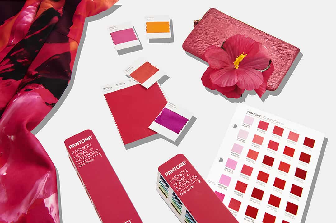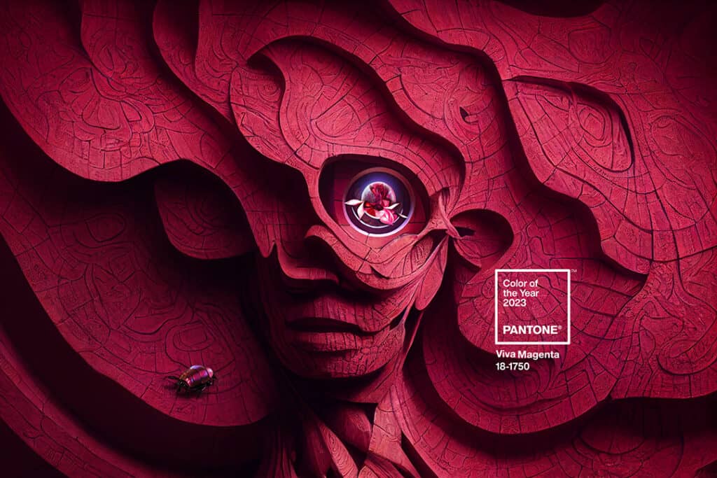
Another year over, and a new year begins – with a new color from Pantone! Let’s all welcome Viva Magenta 18-1750, a brilliant red which represents a vibrant and exciting change from the past few years of mostly calming blues and distant grays intended to de-stress a world dominated by Covid concerns and complications. And Viva Magenta is anything but calm, being described by Pantone as vibrating with “…vim and vigor. It is a shade rooted in nature descending from the red family and expressive of a new signal of strength. Viva Magenta is brave and fearless, and a pulsating color whose exuberance promotes a joyous and optimistic celebration, writing a new narrative.” “Viva Magenta” – a proprietary name coined by the Pantone Color Institute – is a bright, vivid shade of pinkish-purple made by mixing equal parts of red and blue pigments. The name also conveys and generates a sense of excitement and expectancy: “viva” comes from the Latin word “vivus,” meaning “alive” or “vibrant.”
Pantone has been setting the color standards for the world since 1963, when it introduced the Pantone Matching System®. This system provided reliable color standards for the printing industry across the world by organizing color standards through a proprietary numbering system. Over the years, this color system has morphed into supporting all color conscious industries and materials including textiles, apparel, beauty, interiors, architectural and industrial design, plastics, pigments and coatings. Last year, Pantone went back to the lab for the first time in more than two decades to create the perfect, calming blue in Very Peri 17-3938 in the hopes of placing “the future in a new light.” Echoing the excitement and exuberance of embarking on the new future course set by Very Peri, the company describes Viva Magenta as “…powerful and empowering. It is a new animated red that revels in pure joy, encouraging experimentation and self-expression without restraint, an electrifying, and a boundaryless shade that is manifesting as a stand-out statement. PANTONE 18-1750 Viva Magenta welcomes anyone and everyone with the same verve for life and rebellious spirit. It is a color that is audacious, full of wit and inclusive of all.“
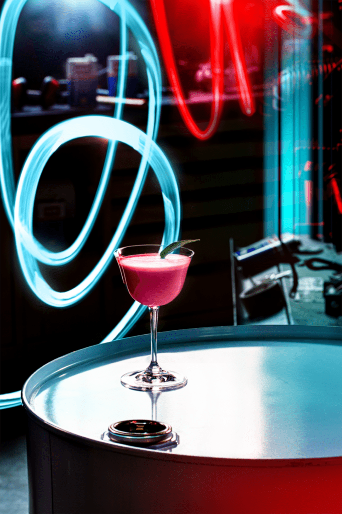
The choice of the color of the year is not a snap decision, as Laurie Pressman, Vice President of the Pantone Color Institute, shares. “There’s a misconception that we gather a bunch of color influencers in a room one day and emerge with the ‘decision’. That couldn’t be further from the truth. The selection does not take place in one isolated meeting at a specific time of year. Instead, it is one long, continuously flowing conversation among a group of color-attuned people.” In seeking a new color direction for 2023, Pantone went back to nature – and history – to find the perfect red to fit the bill, choosing a hue developed from the red of cochineal, a natural dye which has a long and storied history dating back thousands of years to ancient Phoenicia. Cochineal was widely used in North and South America by the Mayan and Aztec empires; 15th century Spanish explorers of the new world harvested cochineal to ship back to Europe where it was a precious commodity rivaling gold and silver.
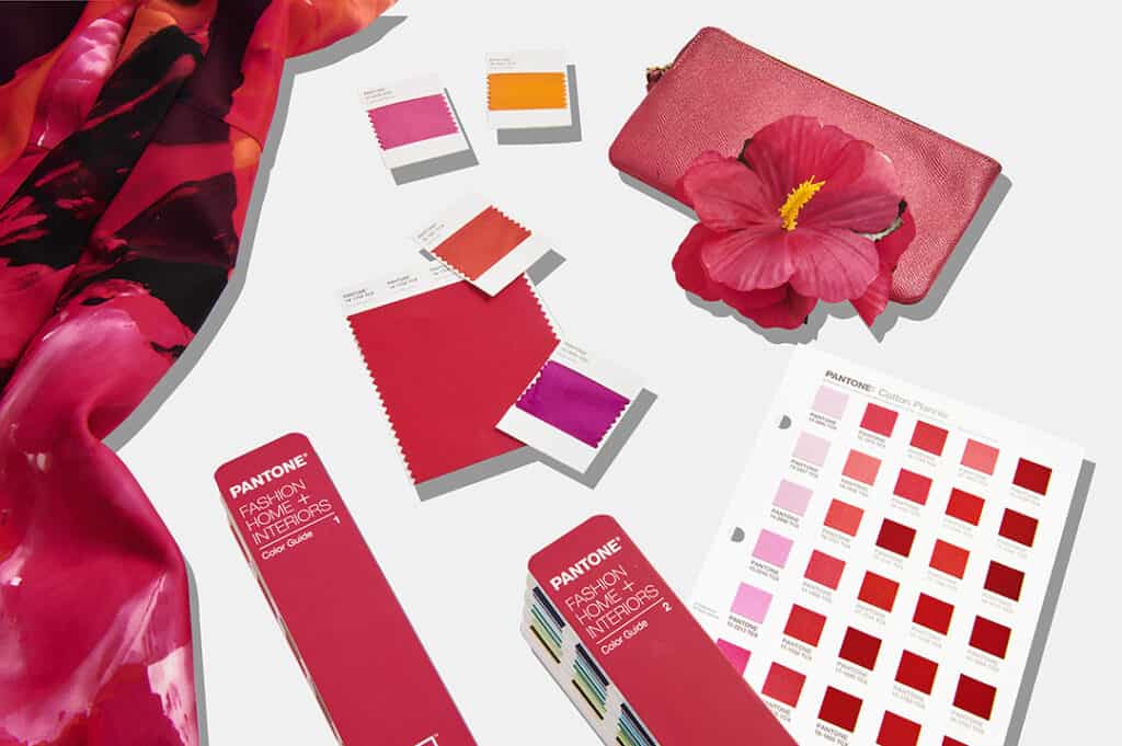
What exactly is cochineal? In short, it’s bug juice. Cochineal (also known as carmine or carminic acid) is the chemical extract harvested from dried female scale insects which live and grow on prickly pear plants. The insects are dried, crushed and the cochineal pigment is extracted – a process in use for thousands of years and the resulting dye being used to color food, textiles and cosmetics for centuries. Pantone refers to Viva Magenta as “[r]ooted in the primordial” What could be more primordial than a bug? The company further describes the 2023 Color of the Year: “PANTONE 18-1750 Viva Magenta reconnects us to original matter. Invoking the forces of nature, PANTONE 18-1750 Viva Magenta galvanizes our spirit, helping us to build our inner strength. In this age of technology, we look to draw inspiration from nature and what is real. PANTONE 18-1750 Viva Magenta descends from the red family, and is inspired by the red of cochineal, one of the most precious dyes belonging to the natural dye family as well as one of the strongest and brightest the world has known.”

So, how can you incorporate Viva Magenta into your home space? A powerful, unexpected and uplifting color, Viva Magenta immediately draws the eye when used to paint an accent wall; alternatively, use it to pack a happy punch with various accessories and textiles, including pillows and lamp shades. If you’re not yet ready to jump head first into the deep end of the Viva Magenta pool, try some magenta flowers in a white vase placed on magenta table linens with a few candles for a bright and striking table setting. While magenta lends itself very well to mixing with white, lighter shades of blue and green are also excellent color matches. Maybe you’d like to repurpose a tired chair or table? Try magenta – and to really make the color pop, skip flat paint in favor of a shiny or lacquer finish. Paired with a fun upholstery fabric, you’ve created an eye-catching accent piece. Viva Magenta is just happy – use it in your decor to put a smile on your face!


