Come the end of the year, interior designers hold their breath in anticipation of an announcement that sets the tone for the year ahead: Pantone’s Color of the Year. For 2018, it is the celestial Ultra Violet. While 2017’s color, Greenery, was an earthy complement to much of the East End’s beauty, this year’s cosmic shade lends itself to the sophisticated and inimitable style of the Hamptons and the North Fork. Bold and thought provoking, ultra violet’s endless opportunities are reminiscent of the galaxy it imitates.
Color of the year is selected by the Pantone Color Institute, which offers color trend forecasting, brand color development, custom color solutions, and a bevy of other colorful offerings to businesses worldwide. Selecting one color to set the trends and tones for the year is no easy task, and one that is as thoughtfully planned out as the unique color strategies the organization provides to their clients.
“We are living in a time that requires inventiveness and imagination,” said Leatrice Eiseman, executive director of the Pantone Color Institute, when Ultra Violet was announced last December. “It is this kind of creative inspiration that is indigenous to Pantone 18-3838 Ultra Violet, a blue-based purple that takes our awareness and potential to a higher level. From exploring new technologies and the greater galaxy, to artistic expression and spiritual reflection, intuitive Ultra Violet lights the way to what is yet to come.”

For local East End designers, like Norine Pennacchia who owns touchGOODS in Southold, Pantone’s Color of the Year promises to be exciting in terms of design. Indoor, outdoor, and in between, ultra violet has more potential than one may think. “I love that the color of the year is ultra violet,” Pennacchia says. “It’s mysterious and bold, and I think it’s more versatile than people think and can easily pair with modern color palettes, but most especially with its reliable complementary counterpart – a color often used in mid-century design – yellow. Opposites do attract, and for those decorating with mid-century color palettes, it’s a no-brainer that warm shades of yellow can be jazzed up and live harmoniously with bold violets.”
With her store specializing in midcentury and modern furnishings and accessories, Pennacchia shares brands her store carries typically offer pieces in a number of these colors. Her personal favorite, Bend Goods, stocks indoor and outdoor versions of the classic peacock chair in gold wire with ultra violet and gold accented pillows. “Ultra violet is the perfect accent to the gold metallic element tones here on this Bend Goods Peacock Lounge Chair,” she says. “It’s a take on the iconic design that was made famous in the 1970s. The geometric pattern in this indoor/outdoor chair is made completely from wire.”
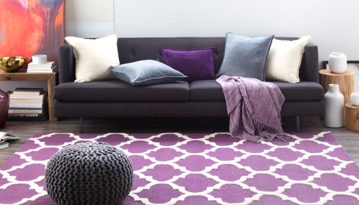
Debra Gildersleeve’s design aesthetic leans toward modern, beach-inspired décor with cool, clean lines. No stranger to mixing colors, materials, and styles, she says ultra violet can be thoughtfully blended into an already-designed space in a cohesive manner. “Ultra violet will do well in sophisticated settings with metallic accents like silver and gold,” she shares. “It’s bold enough to make a statement without being overpowering. Think of a beautiful oriental style rug in a bright shade of ultra violet beneath a silver metallic table, with linen tufted chairs in neutral shades like cream or gray. Creatively paired with a striking chandelier and a mix of ceramic canisters in tones of ultra violet, this space can be both beautiful and functional.”
Noting that she has noticed a trend in people leaning away from more traditional furnishings, Gildersleeve says homeowners are going for a more casual, non-cluttered look. “An eclectic yet tasteful mixture highlighting ultra violet could again be a bold rug in a living room with a leather sofa, purple accent pillows, and modern furnishings,” she says. “Blending different pieces that aren’t necessarily matchy-matchy but make sense together is a great and fun way to tell your own story.”

Gildersleeve, who designs interiors on the North Fork, in the Hamptons, Manhattan, and beyond, has two showrooms and a design center in Mattituck at her store, Renee’s. She recommends brands they carry like Surya, Uttermost, and Loloi for home décor products like rugs, lighting, accent pillows, and other accessories in this bold color, many of which can be custom ordered. Wall art is another way to incorporate ultra violet into an existing space, and is another opportunity to make design reflective of one’s personality.
Michael Del Piero founded her namesake interior design firm, Michael Del Piero Good Design, in 2007. With studios in Southampton and Chicago, and a boutique in the latter (psst… a Southampton boutique is coming soon!) she strives to create interiors that are enduring and timeless. Neutral and texture driven palettes often serve as the base of her projects, and the power of color is never ignored. As for ultra violet, Del Piero says it is a bold color that can complement any design style and furnishings. It just depends on how you use it.

“Bold colors are embedded with a great deal of energy and it’s up to you to harness this energy accordingly,” explains Del Piero. “Our environments impact our feelings and emotions, so it’s important to think about how you want a space to feel, and about how you can further these intentions through the use of exciting and unique colors. Colors like ultra violet can be used to turn up the volume just a little, through small accents and accessories, or really make a room shout – think violet upholstery on a major piece of furniture, paint or wallcovering.”
Del Piero goes on to say that a little goes a long way, and ultra violet can be incorporated into a space without overpowering it. For the Hamptons Designer Showhouse in 2017, she designed a dining room with a mix of whites, greys, and black, and a single violet orchid that gave the perfect pop of color into the space. In the case of a guest bedroom Del Piero designed, a rug in a guest room is an example of using ultra violet in a sparingly yet powerful way, allowing it to shine as the focal point. “In designing a space to spotlight this color, we would still use it as an accent in concert with dense textures and earthy natural tones,” she says. “This would ensure that the bold color not be overpowering.”
How Pantone 18-3838 Ultra Violet will transcend design with its dreamy hues and cosmic tones for the rest of the year remains to be seen. What we do know is interior designers are sure to harness their artistic abilities to make this spiritual color glow in living spaces on the East End, and perhaps throughout the universe.